Cobear
Beverage Company
3D Digital Illustration
Role
- Graphic esigner
Duration
- 3 weeks
Tools
- Adobe Illustrator
Introduction
- This project was to make a poster advertisment for a fictional beverage company using Adobe Illustrator. Starting with designing a logo to the packaging of the beverage with using 3D tools in Adobe Illustrator.
Project Outlines
The Goal of this project is....
This project is to make an advertisment of a fictonal beverage company.
The project brief is including marketing aspect, such as where do the beverage launch, who will be the target audience, etc...
The process of this project is define the position of the company, then design a logo for it, then design the package and poster for selling the beverage.
The Company Position
CoBear is a coffee beer company that will be launched in their online shop, you may also purchase in bars, restaurants, and Liquor stores. CoBear is a combined word of “coffee” and “bear”. The fun fact about the name chosen is the pronunciation of “bear” and “beer” is similar, the owner thought it is more signature if used bear as the name.
Target Audience
As its name implies, coffee beer is a beverage that combined coffee and beer. The drinks were invented in the 1990s, during a boom in the brewing industry. Most coffee beers have an alcohol content of around 4 percent ABV, alcohol by volume. Therefore, the target audiences will be targeting the ages of 20~55, over 18 years old adults for all genders. It is geared to workers and family drinks for dinner. People who enjoy drinking coffee and beer, and also love to try something new. This will be the alternative drink to beer. Actually, the younger generation will be our main target audience so the logo and packaging design will be neutral, attractive, and outstanding.

Logo Design
For the logo design, there is a bear head created by the letter C. The beard also sounds like “bear” and “beer”, which actually is the form of the beer. It symbolized the form stick at their mouth when drinking beers. The logo design is combined with some neutral signs, a bear, and a beard for instance. Because bears are generally thought of as girl things, and the beard represents a male symbol. We chose Cocogoose as the typography of the logo, it’s a bold, round font style. The reason of chose this font is it’s outstanding. It emphasizes the name even when it becomes small, people can recognize the logo in the far distance.
Final Logo
For the color choice, we chose brown as the main color of the logo design. The reason of choose brown tone color as color because brown usually represents coffee and beer. Gradient color was also applied to the color version because it’s more stereoscopic and represented the reflection of the coffee beer.
Poster
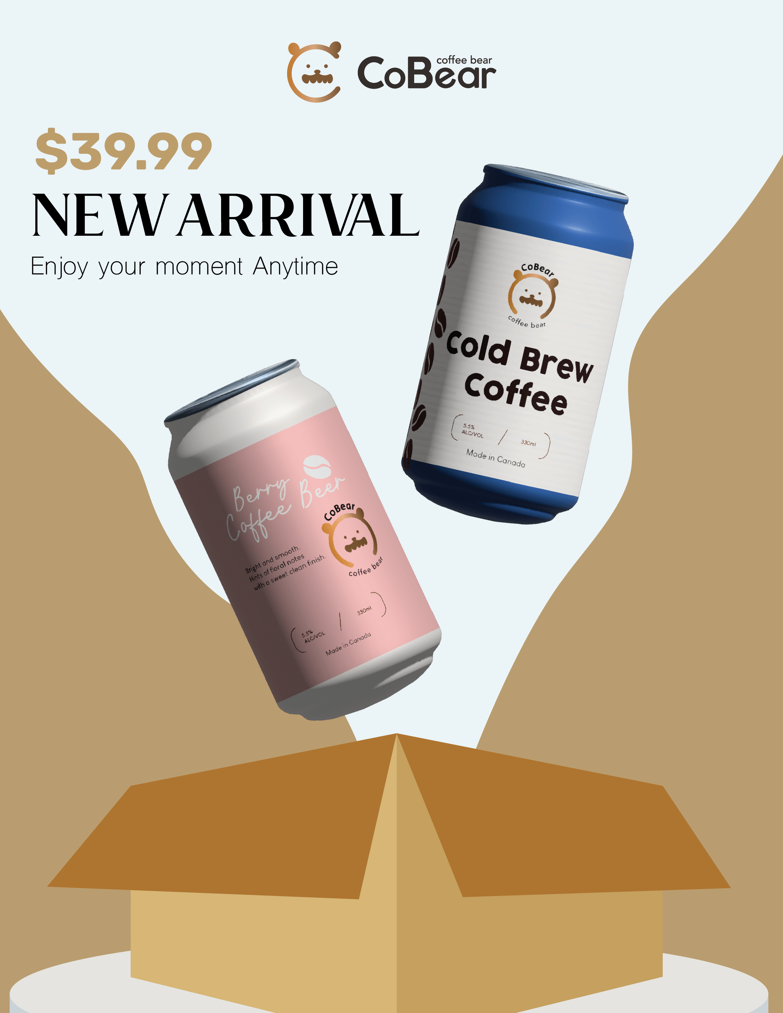
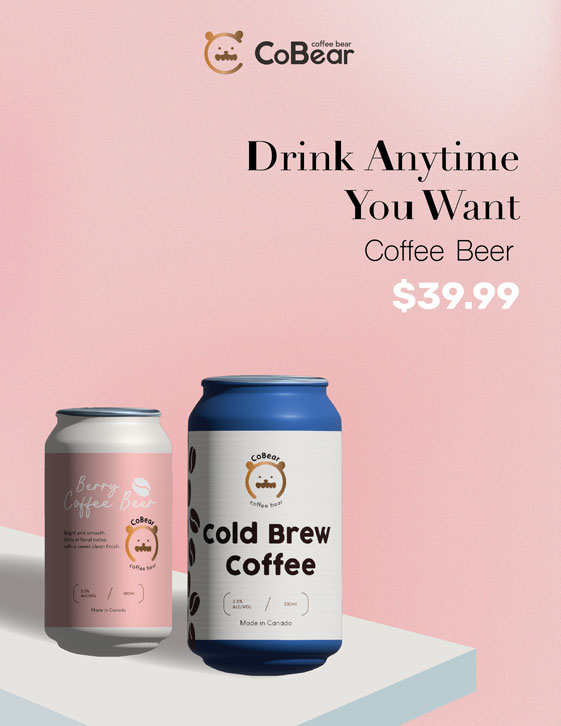
Finally, here are my final design of posters. I choose to do a simple design, gave it a lot of white space on the posters because I want to stay focus on the products.

