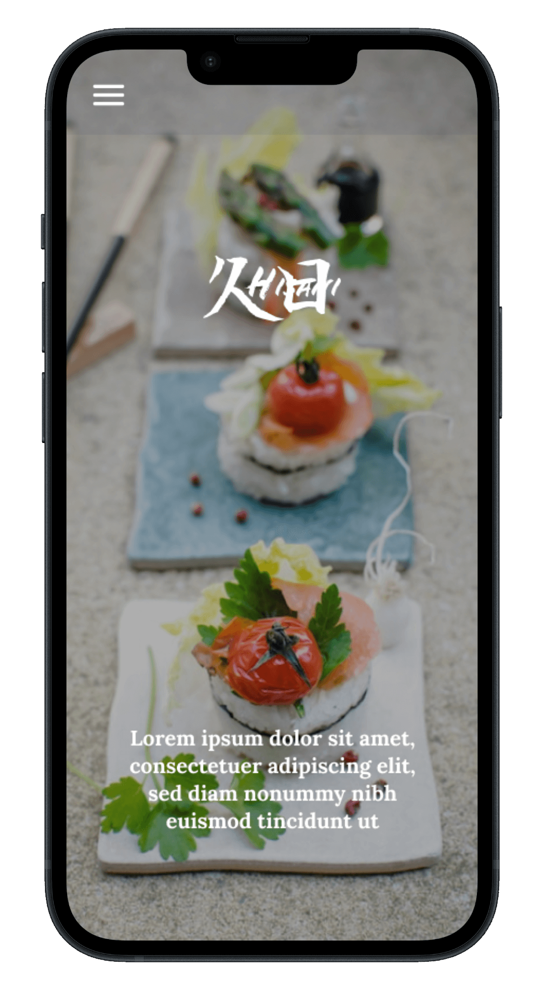
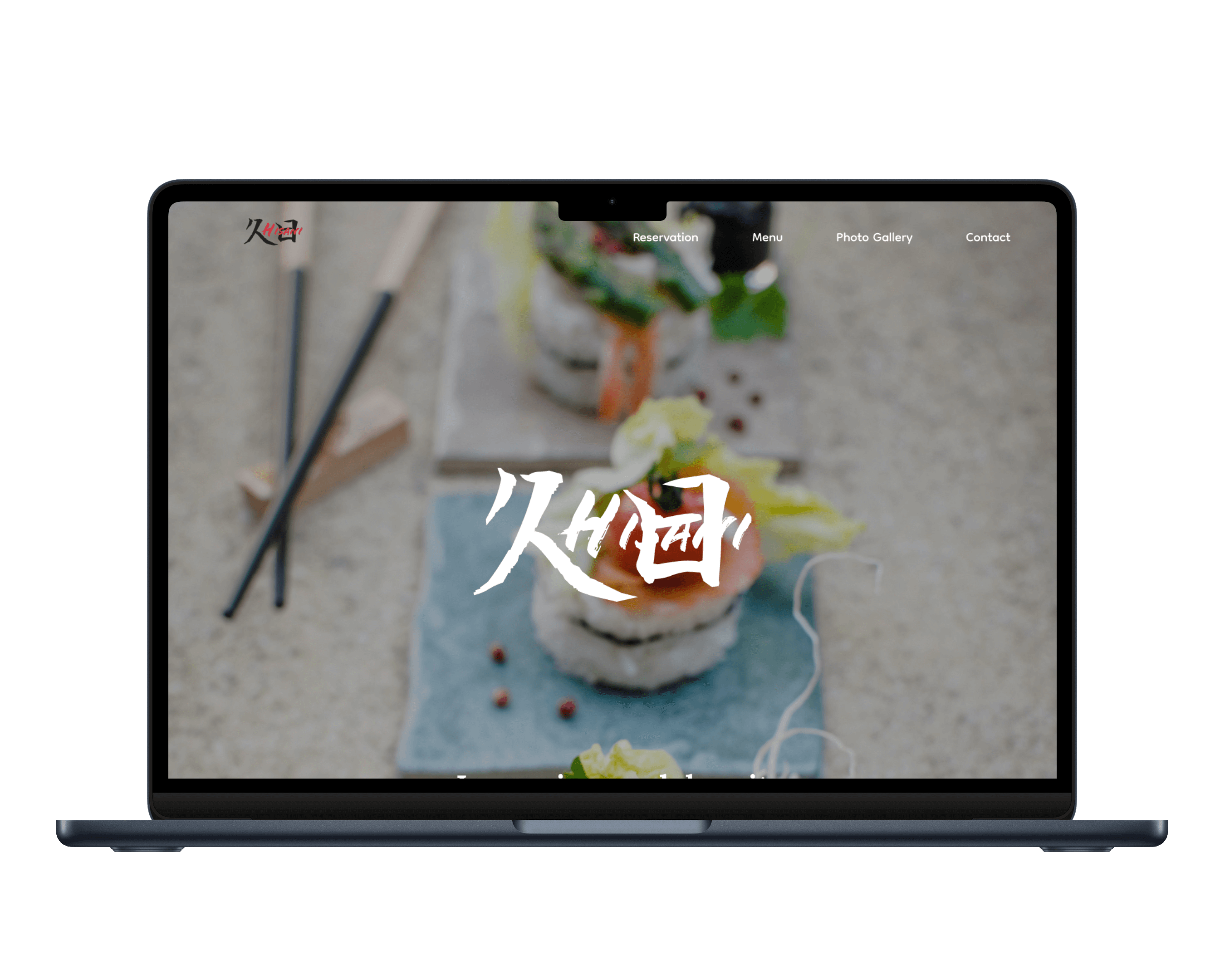
Hisani
Omakase Restaurant
Mobile-first single-page website
Role
- UIUX designer
Web Developer
Duration
- 15 hours
Tools
- Figma
HTML
CSS
JavaScript
Introduction
- The assignment goal is to understand how to code a one-page site with using CSS and JavaScript to code three different size of devices based on a prototype on Figma.
Project Outlines
The Goal of this project is....
The aim of this project is to design and hand-code 3 device sizes for mobile, tablet and desktop.
Starting to design the layout in Figma and using HTML, CSS and JavaScript to code the website.
What is Hisani?
Hisani(久日) is a fiction Omakase restaurant that located in Vancouver.
Omakase in Japanese means "chef's choice." It refers to a dining experience where the customer entrusts the chef to choose and prepare a multi-course meal.

Design
I started designing the layout in Figma. As the topic of this project is Omakase restaurants, the website design should look high-end and luxury since the price of Omakase are relatively high. However, considering that it is a restaurant located in Vancouver, the target audience are not only Japanese but also people who come from all around the world. Then, I decided to design a website that looks trendy and exclusive, rather than a traditional Omakase website.

Coding
I built the website's foundation using HTML, styled it with CSS, and implemented a dynamic hamburger menu using JavaScript for mobile and tablet devices. The main challenge was making the website responsive to different screen sizes, which I achieved by utilizing CSS grid and media queries. By doing so, I was able to optimize the layout for desktop, tablet, and mobile devices.